What’s in a logo?
Tank deconstructs and revamps the Canada 150 logo in this new animation.

The federal government and Tank, the AOR for its 150 celebrations, have unveiled a new logo that will be displayed at official anniversary celebrations throughout the country over the next 12 months.
 The logo is an update to the one that a University of Waterloo student designed to win a national competition in 2015. The previous government’s decision to award the logo based on a contest with a $5,000 prize rather than hiring professionals was hugely unpopular in the design community. Some had already created a site featuring alternative designs to a shortlist of logos the government released in 2013.
The new logo is similar to the contest winner’s, but it ditches the multi-colour scheme in favour of simple white lines on a red background. In doing so, the emphasis shifts from a collection of coloured blocks to a series of interconnected lines.
Tank partner and ECD Alex Gadoua says the agency wanted to convey the richness and diversity of the celebrations, and that the lines work with the theme of connecting Canadians in the anniversary year.
A new animation shows the possibilities in both the logo and the celebrations.
“By deconstructing it and reconstructing it, what we’re showing is that there’s a lot of stuff in that logo and, hence, in the celebrations,” Gadoua says.
[iframe_youtube video = “qN8o8RT79nI”]


Related Articles

7 Comments on “What’s in a logo?”
Leave a Reply
Random Cool»

This year’s selection of under-the-radar ideas includes better for the planet deodorant and a way to level up your bread making.
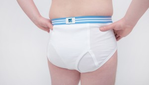
Rethink created a pair of briefs for Prostate Cancer Foundation BC that let men get tested without baring it all.
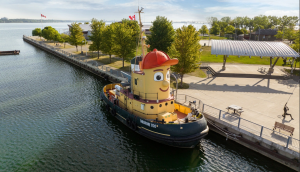
A replica of the titular TV vessel is offering overnight visits to non-crew members for the first time in 22 years of service.
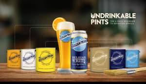
The beer brand has released paint colours to encourage employees to reclaim their own spaces after years of working from home.
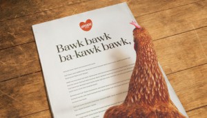
Rethink created an animatronic hen to build hype for Nuggs, a McCain-backed vegan nugget brand.

Everything is very open with a clear explanation of
the challenges. It was definitely informative. Your site is useful.
Many thanks for sharing!
Great post. I was checking constantly this blog and I am inspired!
Extremely helpful information specifically the last part
🙂 I take care of such info much. I used to be seeking this certain info for a very lengthy time.
Thanks and good luck.
Everything is very open with a really clear explanation of the challenges.
It was definitely informative. Your website is very helpful.
Thank you for sharing!
Hello there! Quick question that’s completely off topic.
Do you know how to make your site mobile friendly?
My weblog looks weird when viewing from my iphone4. I’m trying to find a template or plugin that might be able to fix this problem.
If you have any suggestions, please share. Appreciate it!
nordvpn 350fairfax
Ridiculous quest there. What occurred after? Good luck!
Ремонт бампера автомобиля — это популярная услуга, которая позволяет обновить заводской вид транспортного средства после незначительных повреждений. Передовые технологии позволяют убрать царапины, трещины и вмятины без полной замены детали. При выборе между ремонтом или заменой бампера https://telegra.ph/Remont-ili-zamena-bampera-05-22 важно рассматривать масштаб повреждений и экономическую рентабельность. Экспертное восстановление включает подготовку, грунтовку и покраску.
Смена бампера требуется при серьезных повреждениях, когда ремонт бамперов неэффективен или невозможен. Расценки восстановления варьируется от материала изделия, степени повреждений и марки автомобиля. Пластиковые элементы допускают ремонту лучше железных, а инновационные композитные материалы требуют специального оборудования. Грамотный ремонт продлевает срок службы детали и сохраняет заводскую геометрию кузова.
Я всегда готов оказать помощь по вопросам Ремонт бампера в нижнем новгороде – стучите в Telegram qmu70
Truly when someone doesn’t understand after that its up to other users that they will
assist, so here it takes place.