Sponge-worthy business cards and designer basketballs
OneMethod gets a makeover for its sweet 16.
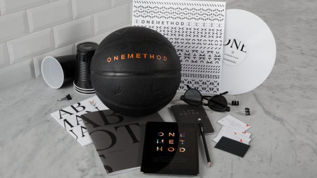
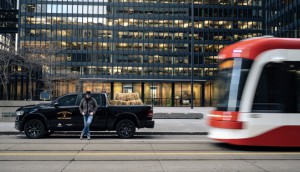
They’ve gone from a Mississauga condo to new digs in the CBC building. So after 16 years of making ads, clothing, tacos and ice cream, OneMethod (part of Bensimon Byrne) decided it was time for a rebrand.
The agency’s new logo builds on the idea of taking things apart and putting them back together. The signature element is the M in Method, which incorporates the number 1.
“This would keep the lockup really clean and avoid us having to float an icon somewhere around a separate wordmark,” the agency explained in its online description of the process. “While we were chopping up letters and shapes, trying to find a solution, we noticed how interesting some of the parts looked on their own and what those parts could stand for in a larger brand system.”
So the logo was exploded into pieces, which “represent what OneMethod is all about, a bunch of different folks with different skillsets, that fit together under one method to create creative things.”
Oh, and they also made some fancy business cards (so fancy each person only gets five, numbered like an art print, so they have to be very discerning in determining who is “sponge-worthy,” as they put it). The full collection of cards across the entire staff comes together like a puzzle. And since the new Wellington Street office has a basketball court, they designed a special ball.
You can read more about the rebrand here.
Related Articles
One Comment on “Sponge-worthy business cards and designer basketballs”
Leave a Reply
Random Cool»

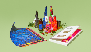
This year’s selection of under-the-radar ideas includes better for the planet deodorant and a way to level up your bread making.
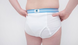
Rethink created a pair of briefs for Prostate Cancer Foundation BC that let men get tested without baring it all.
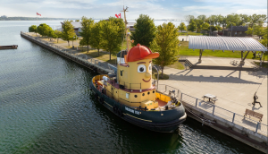
A replica of the titular TV vessel is offering overnight visits to non-crew members for the first time in 22 years of service.
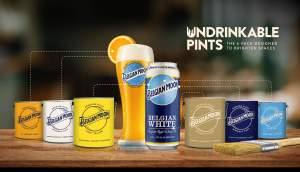
The beer brand has released paint colours to encourage employees to reclaim their own spaces after years of working from home.
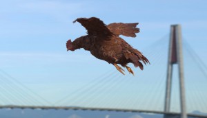
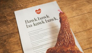
Rethink created an animatronic hen to build hype for Nuggs, a McCain-backed vegan nugget brand.

I feel that making an impression on someone – especially in working regard is extremely important. Hence, using different and fancy business cards also does seem to be an excellent habit to adopt if you want to make an impression.