‘H’ for effort
Atelier BangBang has made Hexarem's 'H' into the centerpiece of a complex new design.
Independent consulting firm Hexarem is giving itself a makeover for its fifth birthday, and it’s picked design agency Ateliger BangBang for the job.
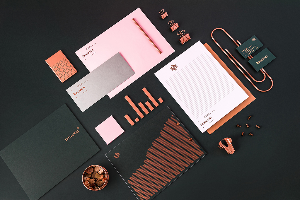
The new visual identity mixes a modern, geometric style with a timeless flair. The logo incorporates the letter “H,” which in turn lends itself to a more complex pattern.
The colour palette incorporates rose gold, classic blue-black and the shade we’re pretty sure is called “millennial pink.”
The redesign extends to Hexarem’s stationary, customer-facing materials, website and more. It has already received accolades from Quebec’s Grafika competition.


Credits
Client: Hexaren
Agency: Atelier BangBang
Artistic director: Simon Laliberté
Design: Simon Laliberté, Étienne Rochon (Aanagram Studio)
Coordination: Alexandra Whitter
Photography: Jany Tremblay


Random Cool»

This year’s selection of under-the-radar ideas includes better for the planet deodorant and a way to level up your bread making.

Rethink created a pair of briefs for Prostate Cancer Foundation BC that let men get tested without baring it all.

A replica of the titular TV vessel is offering overnight visits to non-crew members for the first time in 22 years of service.

The beer brand has released paint colours to encourage employees to reclaim their own spaces after years of working from home.

Rethink created an animatronic hen to build hype for Nuggs, a McCain-backed vegan nugget brand.

Leave a Reply