Steam Whistle toots its own horn with redesign
The Toronto-based brewery will now include ingredients and nutritional information, even though it's not required by law.
Just in time for patio season, Toronto-based Steam Whistle Brewing has unveiled a new look.
After 18 years sporting the same, distinctive, lime green branding, the pilsner company has decided to refresh its packaging, opting to include an ingredients label and nutritional information even though they’re not required to by law. Mic drop.

The repackaging comes with a social campaign #WhatsInYourBeer, which highlights the fact that, although Canadian brewers are not required to list their ingredients, Steam Whistle has nothing to hide.
In addition, redesigned bottles, cans and glasses will of course feature that glimmering steam whistle on the logo, which has been updated to be larger and more streamlined.


Related Articles


One Comment on “Steam Whistle toots its own horn with redesign”
Leave a Reply

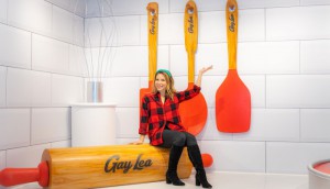
Random Cool»

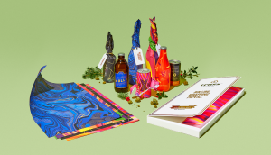
This year’s selection of under-the-radar ideas includes better for the planet deodorant and a way to level up your bread making.
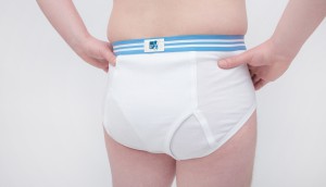
Rethink created a pair of briefs for Prostate Cancer Foundation BC that let men get tested without baring it all.

A replica of the titular TV vessel is offering overnight visits to non-crew members for the first time in 22 years of service.
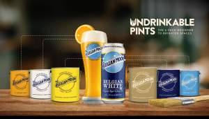
The beer brand has released paint colours to encourage employees to reclaim their own spaces after years of working from home.

Rethink created an animatronic hen to build hype for Nuggs, a McCain-backed vegan nugget brand.

How you can continue to honour this company’s creative tack when even 18 years ago it was clear to me that they plagiarized their logo from an old piece of clip art, continues to boggle my mind!!!! See attached!!!
https://uploads.disquscdn.com/images/d6ce4bb8ba3d046ded9d5c3b306df6ad87f18d223fd3e36ce108291a7d0e8e3a.jpg