Data visualization is as easy as selecting a font
AtF Spark is a typeface that inserts graphs into online stories and posts, no coding required.
When writing content online, it can sometimes be difficult to give your readers the context they need to really understand the impact of facts, data and numbers in your story. Created by London-based design studio After the Flood, “AtF Spark” is a typeface that aims to help writers, journalists and bloggers solve that.
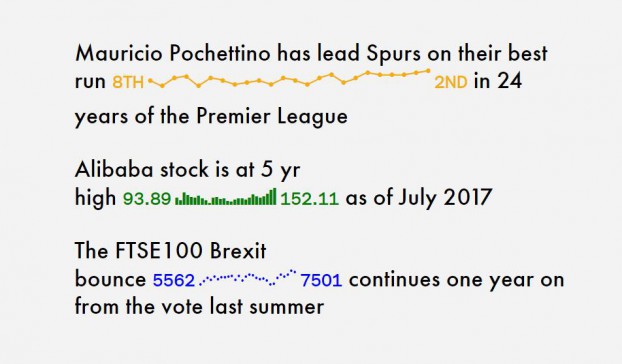
The “spark” in the font’s name comes from “sparklines,” an idea from data visualization expert Edward Tufte where some form of graph is placed right in the text of a story, communicating exactly how drastic the change between the two numbers is, or giving you some quick data to back up the point you’re trying to make. You may have already seen them on sites for financial publications that show recent performance for stocks mentioned in a story.
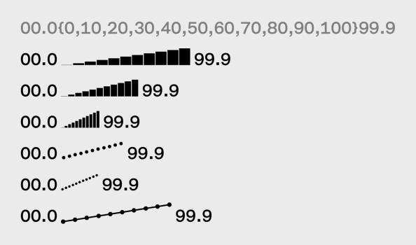
However, those kinds of applications have typically required some level of coding knowledge, leaving sparklines outside the reach of the typical writer. But AtF Spark is an OpenType file, meaning anyone who can drag and drop a file from the downloads folder to the fonts folder on their computer can use it.
This is how it works. After typing the two numbers you want to appear in a post as you normally would, all the numbers you want to be points on the graph are placed in curly brackets between them (think of it as putting a data set in between the two end points of your graph). Then, simply change the font for the numbers to AtF Spark. So, the before-and-after would look something like this:
As designer and After the Flood founder Max Gadney told Fast Company, part of the idea of AtF Spark was to have it actually be used in headlines so the enormity of the data could be communicated as people scrolled past stories on a feed.
Random Cool»

This year’s selection of under-the-radar ideas includes better for the planet deodorant and a way to level up your bread making.
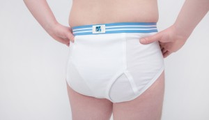
Rethink created a pair of briefs for Prostate Cancer Foundation BC that let men get tested without baring it all.
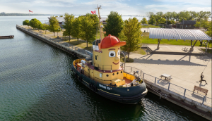
A replica of the titular TV vessel is offering overnight visits to non-crew members for the first time in 22 years of service.
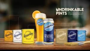
The beer brand has released paint colours to encourage employees to reclaim their own spaces after years of working from home.
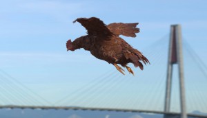
Rethink created an animatronic hen to build hype for Nuggs, a McCain-backed vegan nugget brand.

Leave a Reply