See you in Hell(vetica)
R/GA associate creative director Zack Roif is working through something here.
What’s your biggest fear? Snakes? Fire? Death? Bad kerning? Public speaking? Heartbreak? B ad k e rni ng? Drowning? Tight spaces? Ba d ker ni ng? Losing a loved one? BA D KE R NIN G?
The fact is, designers can be particular. You never know when something is going to pop out at them and incite a reaction so visceral, it will haunt their nightmares for weeks to come. And what’s the best way to deal with fears and anxiety? Why, you do something creative.

Zack Roif, associate creative director of R/GA, channeled his fear of bad kerning in the classic Helvetica font by creating his own custom font (“Hellvetica” – it’s Helvetica, but with the worst kerning you’ve ever seen). The website to promote the font is spooky-scary – let’s just say, Roif has some real issues with bad uses of spacing in Helvetica.
Of course, when someone has a nightmare, you usually comfort them by telling them, “It’s okay, it’s not real, it can’t hurt you!” The problem, though, according to Roif is that bad kerning in Helvetica is indeed very real. Check out these real-world examples.

Hellvetica, a font straight out of purgatory, has received glowing reviews such as “This looks like shit” (-Italian designer Massimo Vignelli, probably from the afterlife); “What have you done?” (-Swiss typeface designer Max Miedinger, also rolling in a grave somewhere) and “I don’t hate it” (-Prince of the Underworld, Satan himself).
Whatever you need to do to work out your fears and neuroses is up to you. This is a safe… space.
77 Comments on “See you in Hell(vetica)”
Leave a Reply

Random Cool»

This year’s selection of under-the-radar ideas includes better for the planet deodorant and a way to level up your bread making.

Rethink created a pair of briefs for Prostate Cancer Foundation BC that let men get tested without baring it all.

A replica of the titular TV vessel is offering overnight visits to non-crew members for the first time in 22 years of service.
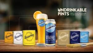
The beer brand has released paint colours to encourage employees to reclaim their own spaces after years of working from home.

Rethink created an animatronic hen to build hype for Nuggs, a McCain-backed vegan nugget brand.

silkroad online pharmacy: enterprise rx pharmacy system – target pharmacy warfarin
viagra 2 VGR Sources viagra online using paypal
sildenafil india paypal: cheap generic viagra for sale – viagra uk order
viagra online with prescription VGR Sources viagra kaufen
https://vgrsources.com/# sildenafil 100mg tablets uk
CrestorPharm: CrestorPharm – can crestor be taken with food
https://semaglupharm.com/# cost of compounded semaglutide
Semaglu Pharm Rybelsus online pharmacy reviews SemagluPharm
Predni Pharm: PredniPharm – generic over the counter prednisone
https://semaglupharm.com/# semaglutide injection dosage
http://lipipharm.com/# Lipi Pharm
Crestor Pharm: ezetimibe vs crestor – ezetimibe-rosuvastatin
LipiPharm can i take magnesium glycinate with atorvastatin Order cholesterol medication online
https://semaglupharm.com/# Semaglu Pharm
taurine and rosuvastatin: can you split crestor in half – CrestorPharm
Lipi Pharm: Lipi Pharm – Lipi Pharm
Pharma Connect USA Pharma Connect USA misoprostol at pharmacy
https://pharmajetzt.com/# apotheke online deutschland
Medicijn Punt Medicijn Punt MedicijnPunt
Pharma Confiance: doliprane et cannabis – monuril chez l’homme
https://pharmaconfiance.shop/# hetre in english
Pharma Jetzt: PharmaJetzt – medikamente auf rechnung bestellen
online medicijnen: apteka nl online – medicijn recept
https://pharmaconnectusa.shop/# propecia united-pharmacy
https://pharmaconnectusa.com/# us pharmacy viagra online
Pharma Jetzt: Pharma Jetzt – luitpold apotheke mГјnchen
Pharma Confiance: Pharma Confiance – metronidazole soleil
Pharma Connect USA pharmacy store hours PharmaConnectUSA
Pharma Jetzt Pharma Jetzt Pharma Jetzt
livraison pharmacie lyon: bonne nuit que dieu vous protГЁge – Pharma Confiance
PharmaJetzt: Pharma Jetzt – PharmaJetzt
Maxalt PharmaConnectUSA PharmaConnectUSA
Pharma Connect USA: discount pharmacy tadalafil – sams club pharmacy
MedicijnPunt de online apotheek medicijnen aanvragen apotheek
apotheek online nl: dokter online medicijnen bestellen – MedicijnPunt
https://pharmaconnectusa.shop/# cheapest pharmacy to get prescriptions filled
PharmaConnectUSA: sands rx pharmacy – Pharma Connect USA
IndiMeds Direct online shopping pharmacy india IndiMeds Direct
https://canrxdirect.shop/# canadianpharmacymeds
IndiMeds Direct: top 10 pharmacies in india – cheapest online pharmacy india
https://indimedsdirect.shop/# reputable indian pharmacies
reputable indian online pharmacy IndiMeds Direct IndiMeds Direct
TijuanaMeds: п»їbest mexican online pharmacies – mexico drug stores pharmacies
http://tijuanameds.com/# TijuanaMeds
indian pharmacies safe: top 10 pharmacies in india – IndiMeds Direct
http://canrxdirect.com/# reddit canadian pharmacy
TijuanaMeds reputable mexican pharmacies online TijuanaMeds
Farmacia Asequible cariban precio Farmacia Asequible
RxFree Meds: RxFree Meds – RxFree Meds
RxFree Meds: RxFree Meds – RxFree Meds
https://rxfreemeds.shop/# RxFree Meds
https://rxfreemeds.com/# meijer online pharmacy
enclomiphene for men: enclomiphene testosterone – enclomiphene citrate
https://rxfreemeds.shop/# cialis pharmacy checker
buy enclomiphene online enclomiphene citrate enclomiphene testosterone
enclomiphene for men: enclomiphene testosterone – enclomiphene for men
parque alcosa como llegar: Farmacia Asequible – epiduo gel farmacia
https://rxfreemeds.com/# RxFree Meds
buy enclomiphene online enclomiphene online enclomiphene
flonase pharmacy: RxFree Meds – RxFree Meds
Farmacia Asequible: Farmacia Asequible – farmacia las palmas online
https://farmaciaasequible.shop/# sildenafil 25 mg comprar online
http://enclomiphenebestprice.com/# buy enclomiphene online
crema brentan precio farmcia barata Farmacia Asequible
Farmacia Asequible: Farmacia Asequible – dercutane 20 mg opiniones
Farmacia Asequible: donde comprar viagra – Farmacia Asequible
https://farmaciaasequible.com/# Farmacia Asequible
farmacias abiertas malaga: para que sirve vimovo – pharmacy online spain
http://ordinasalute.com/# spididol 400 ogni quante ore
https://pharmadirecte.com/# collyre sans ordonnance
brossette inava PharmaDirecte cialis 20mg prix
http://ordinasalute.com/# triasporin sciroppo
dicloreum compresse: plaunazide 20 mg/12.5 mg – riopan gel bustine
proteinbar barn: omeprazol prisjakt – concealer fГ¶re eller efter foundation
dildo apotek: fullmakt apotek vГҐrdpersonal – kan man hГ¤mta ut recept pГҐ alla apotek
apotheek nederland Medicijn Punt internetapotheek nederland
http://tryggmed.com/# pipetter apotek