Animals doing peculiar things on cider bottles
Cid and Vergers de la Colline get a new look from the folks at Lg2.
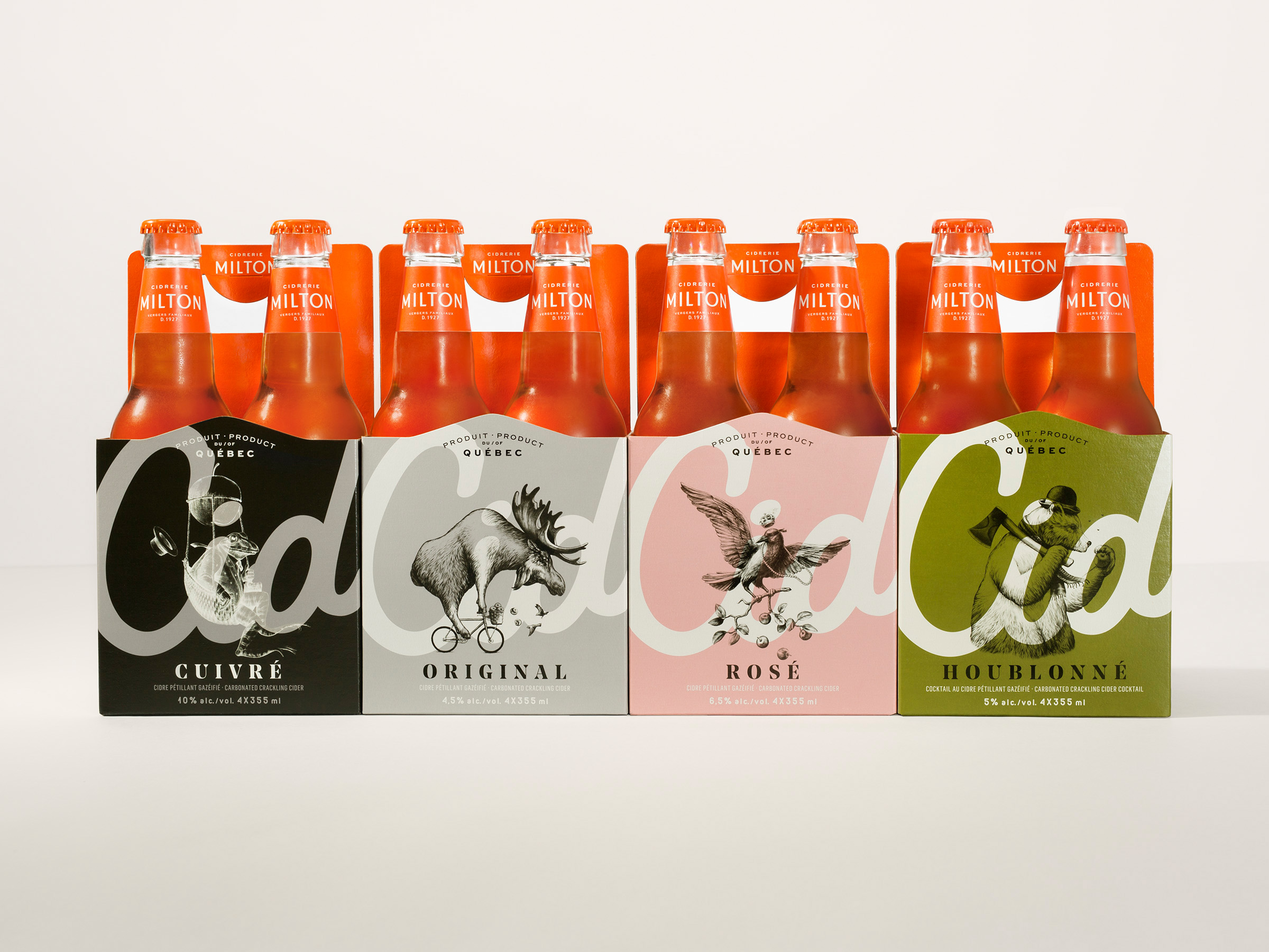
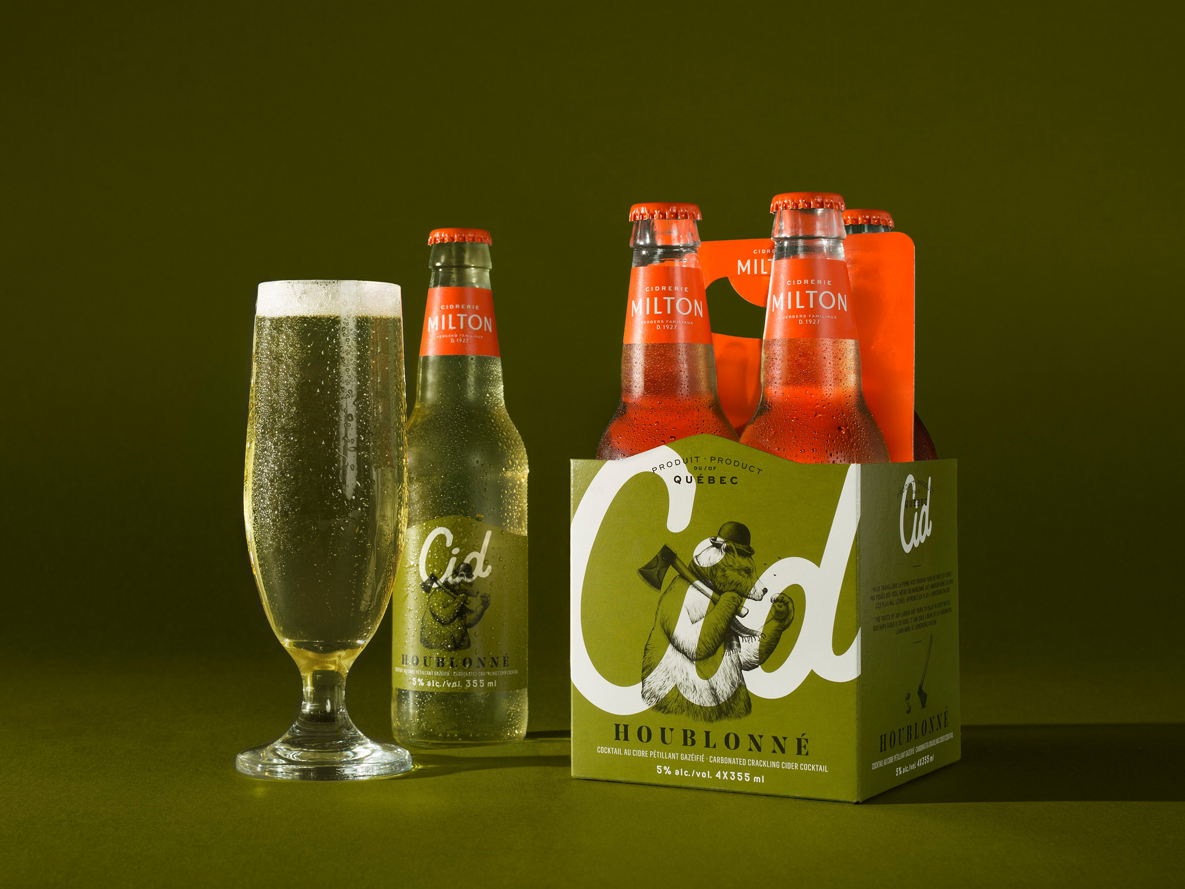
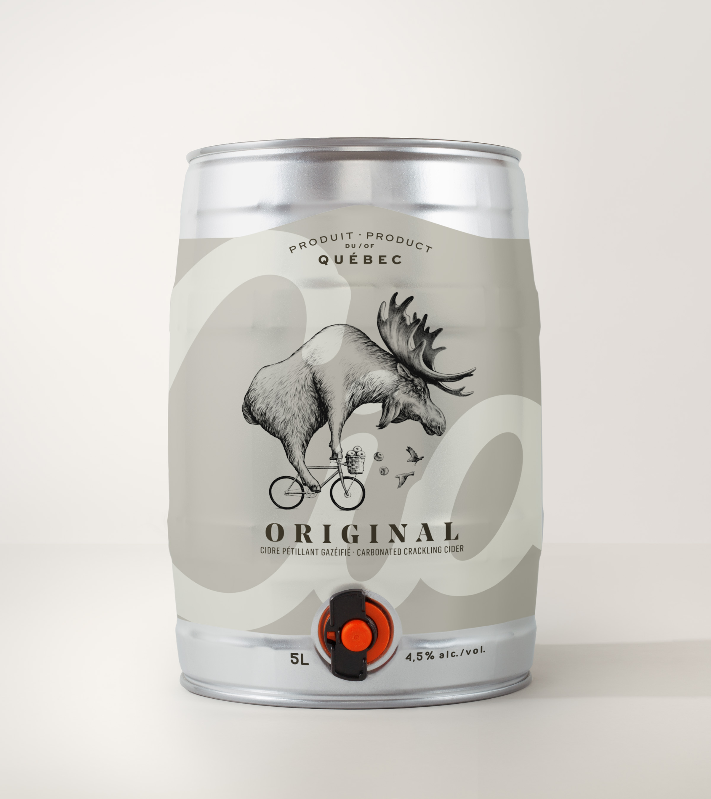
Cid cider (clearly inspired by craft beers) has made a moose awkwardly riding a bicycle half his size part of its branding. It’s peculiar, yes, but it does the trick in getting people to take notice of its products on Canadian shelves.
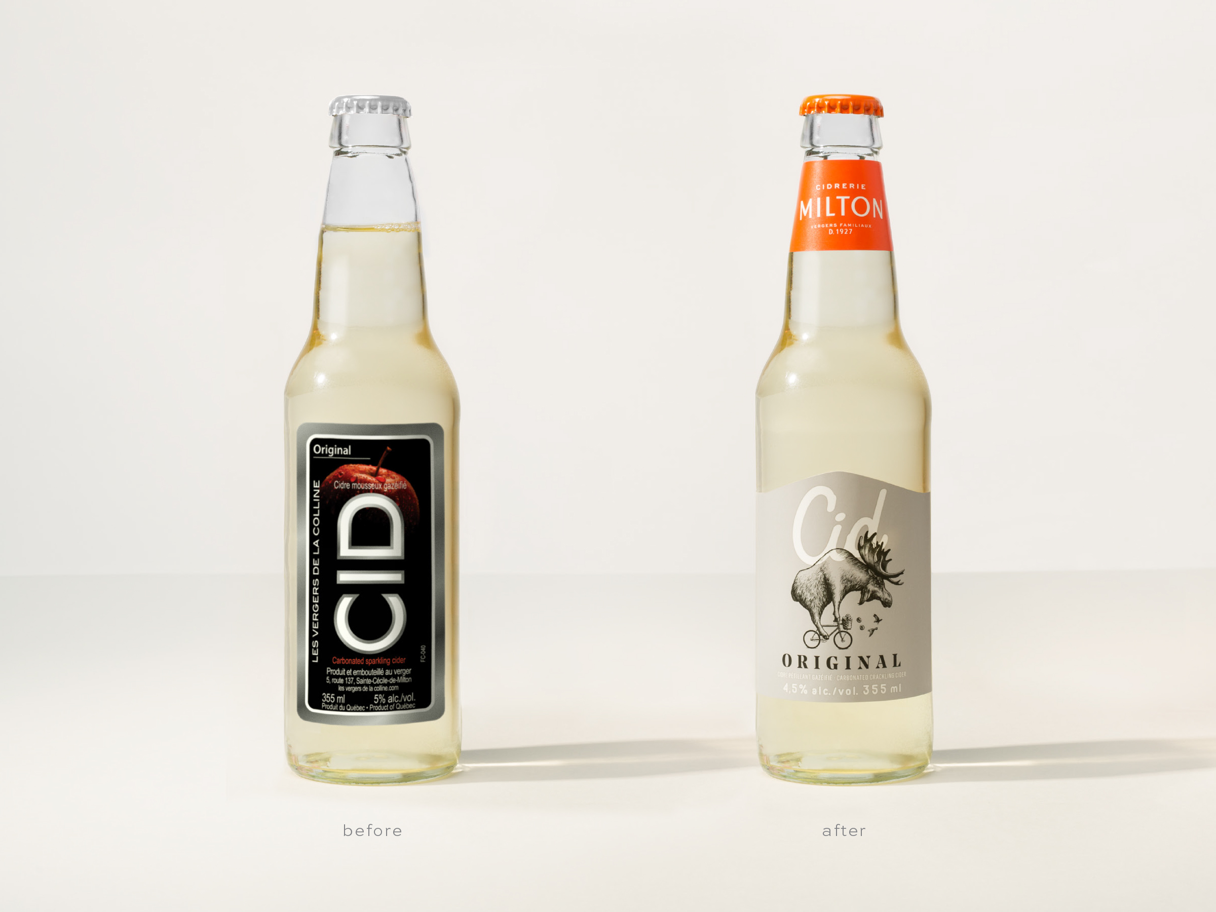
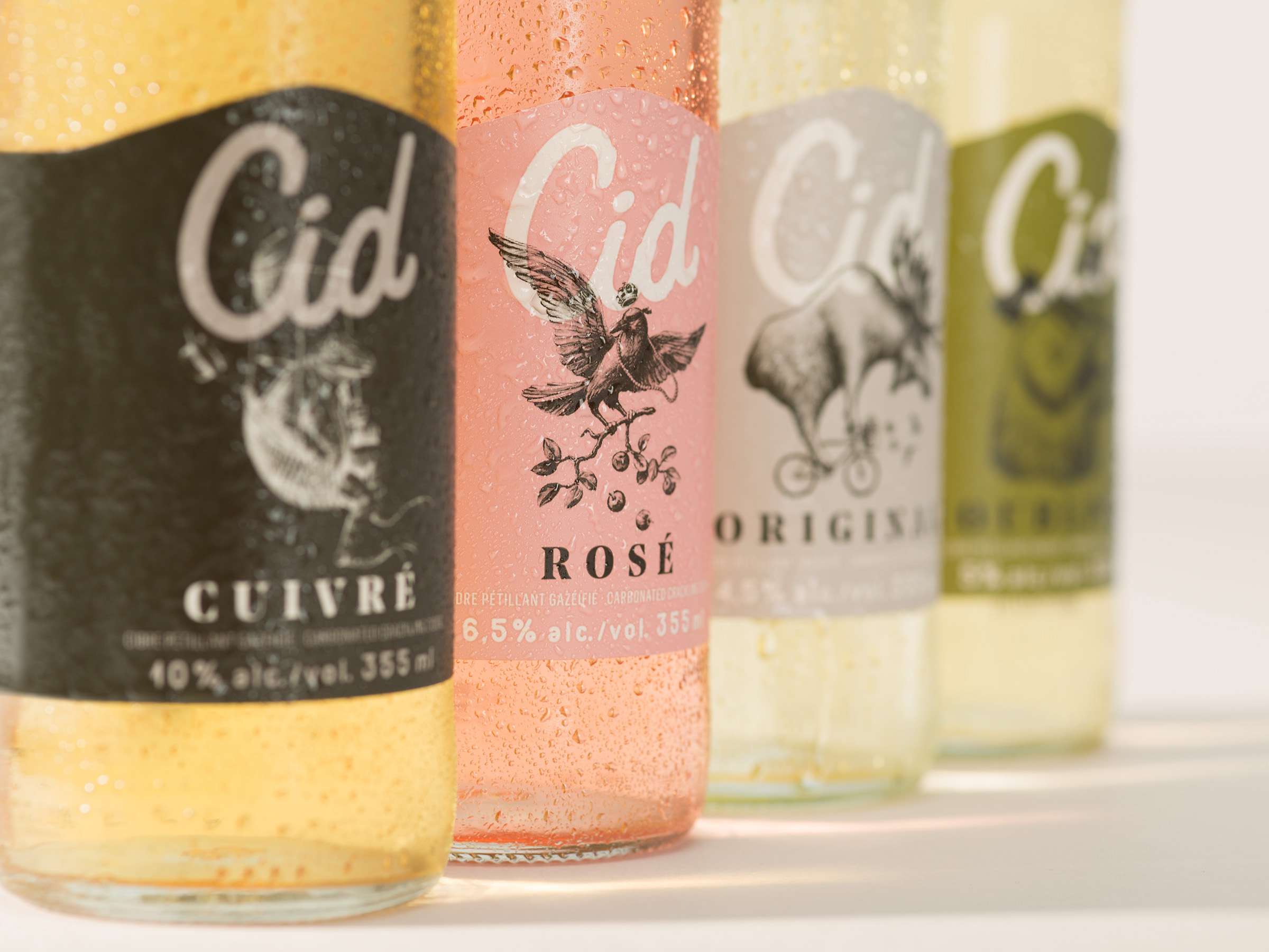
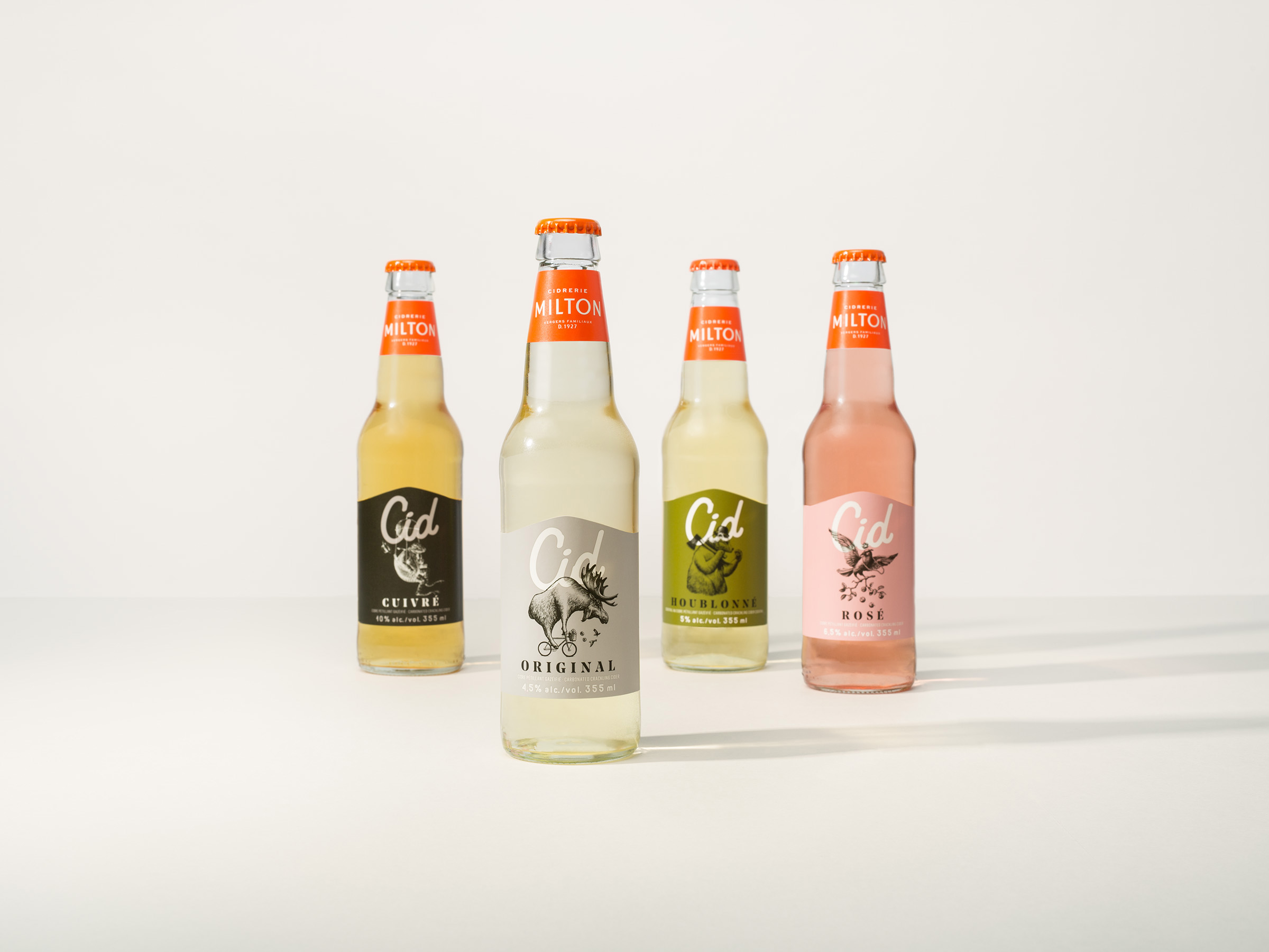
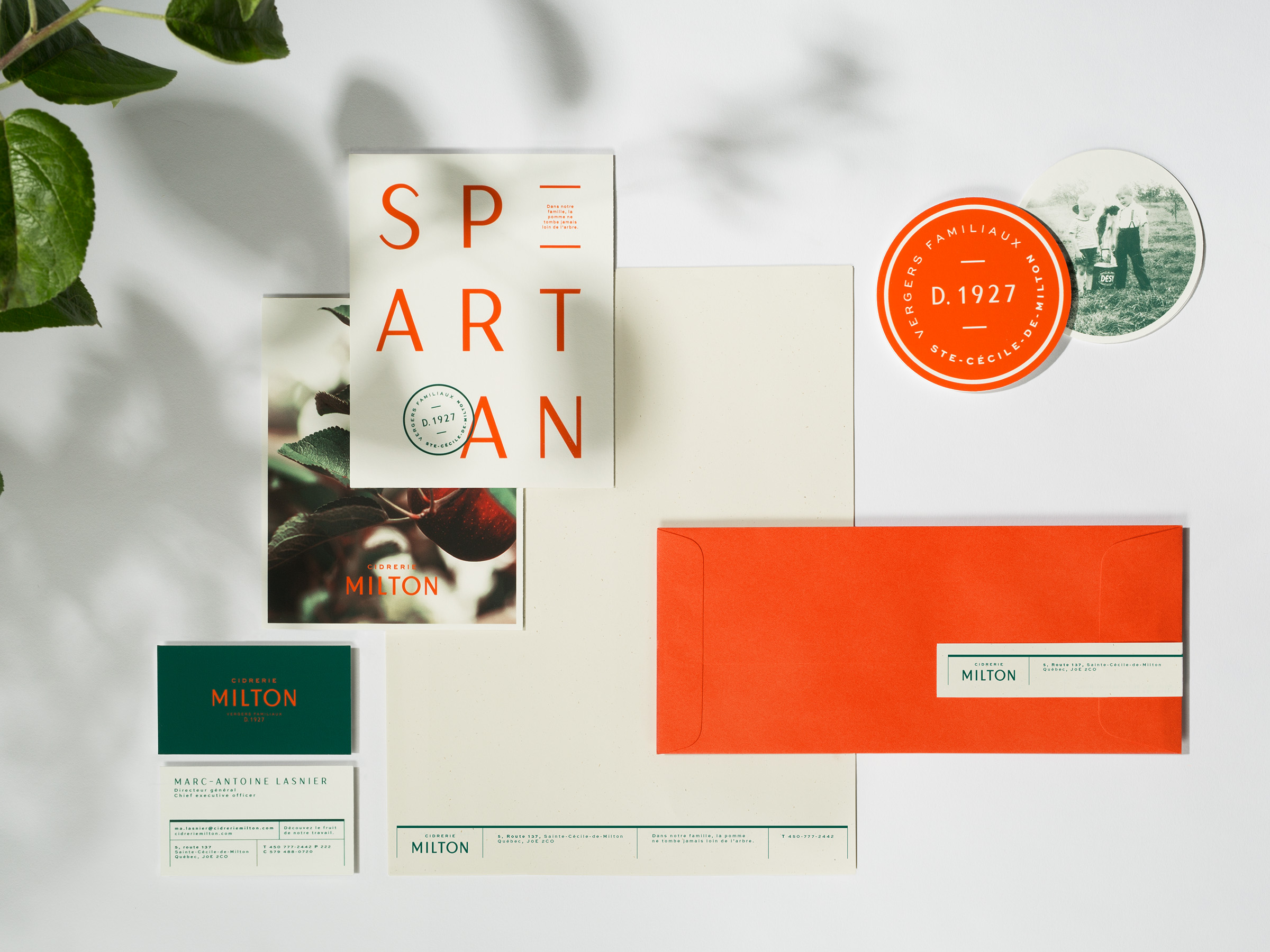
Before creative agency and design firm Lg2 was approached by Vergers de la Colline to beautify its company branding, the company had a pretty stiff appearance. Its cider’s packaging used black and grey labels with an apple hiding mysteriously in the backdrop of its wordmark (above left). But the newly redesigned bottles showcase the four different characters, each representing a distinct flavour (from Rose and Houblonne to Original and Cuivre) in black and white sketches, with the name in a big, bold, contemporary typeface.
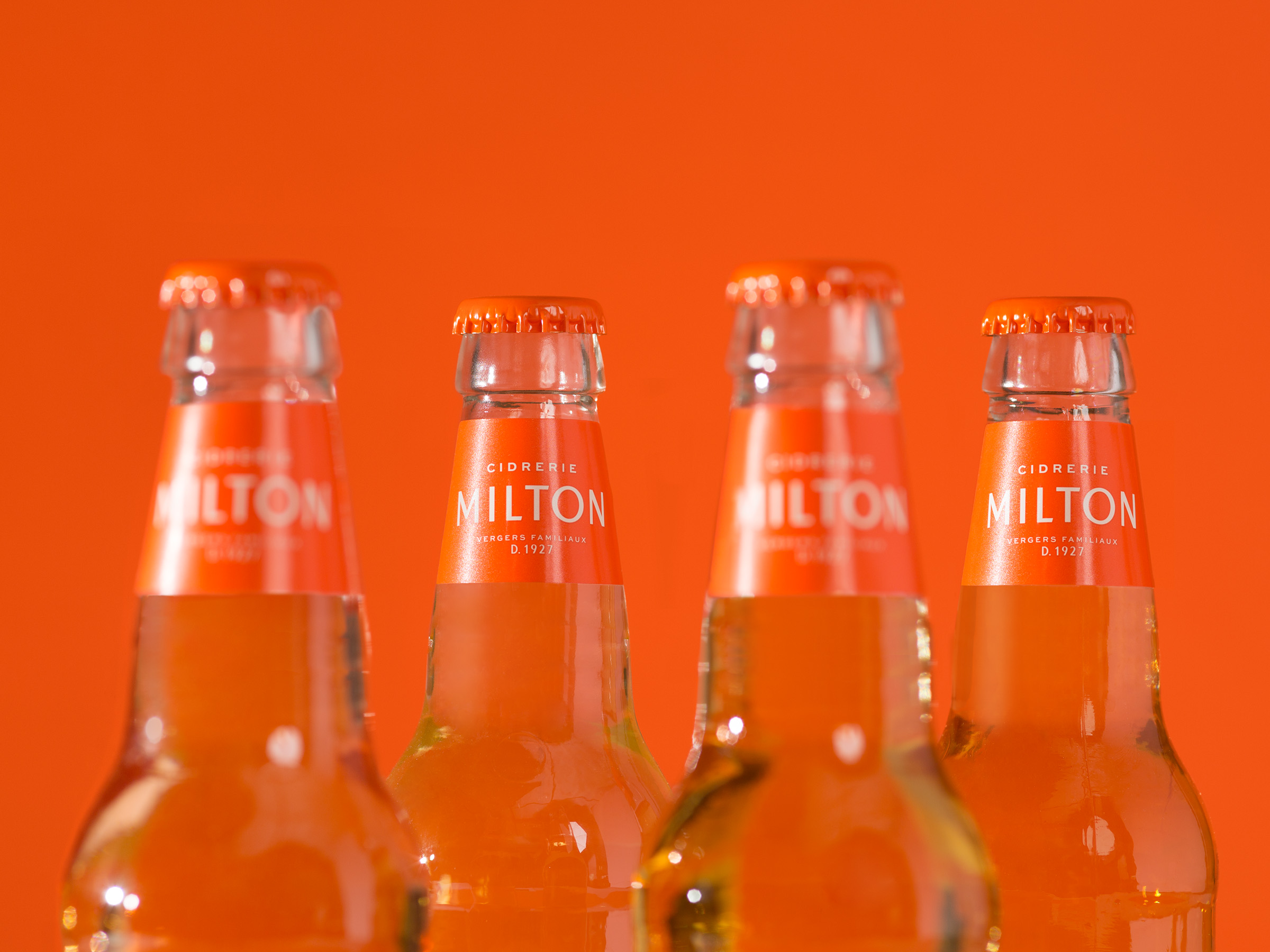
Vergers de la Colline itself , which has been around since 1927, also got a new look and a new name – Cidery Milton. The agency chose green to represent the apples from which it creates its beverages, as well as a bright, solid orange to signify boldness.
Marc-Antoine Lasnier, Cidrery Milton GM, said in a release that the new identity is closely tied to its business strategy, better representing the company it has become over the past 90 years: “an innovative, expert, authentic and bold company that is above all motivated by the exceptional quality of its products.”
“For Cid, we created a style that manages to be both classic and fun. Four illustrations featuring an animal and apple come to life on the packaging in a comical way,” added David Kessous, CD, design at Lg2. “Again, we pay tribute to the company’s boldness while effectively speaking to a younger target.”
Random Cool»

This year’s selection of under-the-radar ideas includes better for the planet deodorant and a way to level up your bread making.
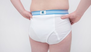
Rethink created a pair of briefs for Prostate Cancer Foundation BC that let men get tested without baring it all.
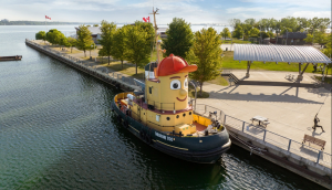
A replica of the titular TV vessel is offering overnight visits to non-crew members for the first time in 22 years of service.
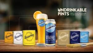
The beer brand has released paint colours to encourage employees to reclaim their own spaces after years of working from home.
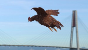
Rethink created an animatronic hen to build hype for Nuggs, a McCain-backed vegan nugget brand.

Leave a Reply