Design AOY Gold: Leo Burnett’s evolution by design
Utility takes the shop's designs to the next level.
This article appears in the November/December 2017 issue of strategy.
Leo Burnett Toronto’s kitchen is stocked with expensive tea from France, and Lisa Greenberg is quick to point out how beautiful the sachets are, lined up neatly in their boxes. She’s tried the elegant blends of leaves, but can’t get off her “crack” — cheap tea, chock full of milk and sugar, nothing froufrou about it.
Aesthetics are important. But if it’s not what gets you going in the morning, then it’s not very useful.
Tea time with the agency’s SVP and head of art is instructive when it comes to how she and her department view design. “We try and do everything with a bit of built-in utility,” she says.
It’s a philosophy particularly important for the ad agency, which functions to help brands prove their value in the world.
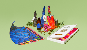
Take one of its Cannes Lions-winning campaigns this year, “Cook This Page” for IKEA, where it created oven-ready parchment printed with a fill-in-the-blank recipe specific to the retailer’s products and ingredients — designed to make cooking as easy as a paint-by-numbers. (The campaign helped propel the agency to snag the inaugural Gold Design AOY award, with the jury scoring it the highest among its other work for Printed by Somerset and the Yellow Pages.)
Formidable design? Yes. But it went beyond nicely designed creative to being something that could actually teach people to cook. More importantly, Greenberg says the project, if operationalized at a larger scale — beyond the 12,500 created for the campaign ? could be a bigger sales driver for the retailer.
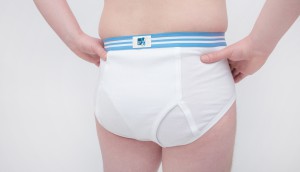
Another example is Knixteen, a new line of leak-proof “period underwear” geared at young women. The brand was looking for promotional help, but the team at Leo went beyond the brief, looking at the project holistically and designing new teen-friendly branding, with packaging that could double as a makeup bag or a heating pad for period cramps.
“There’s so much junk out there,” as Greenberg puts it, but great design is about building something that can last — including brands.
She points to the agency’s work for Enbridge as one example. Back in 2015, Leo looked at all of the facets of the energy company’s business, eventually whittling it down to the concept of “Life takes energy” and using a simple “E=MC2” to show the brand’s role in everyday life. (Similar work is underway for its new U.S. client, AAA.)
At the crux of the project was distilling the brand down to the purest form of communication. “Everybody wants the TD green chair,” she says. “That’s what I think design can do for bigger brands.”
When Greenberg joined in 2010, her task was to build a proper design department that goes beyond traditional advertising. But while a lot of agencies are building out design hubs, it’s easier said than done.
“In the beginning it was really hard for me to get anybody to come over,” Greenberg says. Why? Because agencies tend to treat designers like decorators, she says.
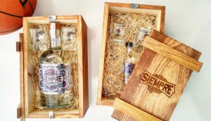
Slowly but surely, her team has proven that’s not the case for Leo, with design-centric passion projects flourishing from within — such as restaurants, chocolate brands and surf boards.
“Design touches everything we do here,” she says (the team even redesigned the office furniture to have a better, cord-free aesthetic).
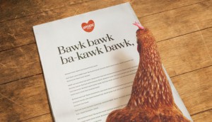
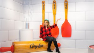
That passion for design has translated to client work, like the Yellow Pages’ “Lemonade Stand,” which was essentially about building a small business brand from scratch. The campaign, built on data and insights, is also an example of how design isn’t an afterthought at the shop. There’s always a “triumvirate” of leaders (accounts, strategy and creative) before the teams are briefed and design is given the same credence as other disciplines, Greenberg says.
As it’s invested in its strategy group and data analysts, respect for design and craft is still being driven from the agency’s leadership. Building out its design department has been supported by the shop’s upper management, including CEO and CCO Judy John, CSO Brent Nelsen and COO David Kennedy. “This is kind of like the perfect storm because [they all] buy into it and we’ve managed to protect the craft of what we do,” Greenberg says.
“[Design has] a different set of references, history [and] way of working than advertising,” adds Ryan Crouchman, group CD at Leo. “A lot of typical ad agencies just… don’t recognize that there is quite a difference.”
Advertising is often executed quickly and sometimes (but not always) has a shorter shelf life. The process for design, however, is often more forward-looking. “You think more about longevity and making something that’s going to endure,” Crouchman says.
Seven years on, Leo’s reputation has gained respect from the design community, with accolades from the ADCC, where it has been named Design Agency of the Year four times (the shop’s “Cook This Page” also won Design Best in Show at this year’s Marketing Awards).
Leo’s design team remains small, counting just six people. But it’s not lacking in passion, which is largely what drives the work beyond initial client asks.
“Cook This Page,” for example, was a project of “pure perseverance,” coming to life only because of the pressure the team put on each other, with support for the project coming from as high up in the network as worldwide CCO Mark Tutssel.
“We’re makers, essentially, at the end of the day,” Greenberg says. “We want to create.”
Right now, the goal is to keep building Leo’s design reputation.
On a greater level, Greenberg believes that Canada can and should be renowned for design, just like Sweden and Japan. “Canada has some of the best designers in the world,” she says. “I’m hoping that we [can create more] beautiful ideas — but very, very smart ideas, beautifully crafted.”
New business
Ferrero Rocher, AAA, Northern California, Vega
Key hires
Graeme Campbell, senior copywriter; Logan Gabel, senior AD; Charlie Glassman, copywriter; James Pacitto, AD
Staff
215
Cases
Campaign: Cook This Page
Client: IKEA Canada
Campaign: Printed By Somerset
Client: Printed By Somerset
Campaign: The Lemonade Stand
Client: Yellow Pages
For full cases, go to designaoywinners.strategyonline.ca/2017


