Koho wakes up image
The fintech brand goes from selling a goth nightmare to a Gen Z dream.

It seems Koho’s brief goth phase is over.
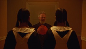
When the financial services brand relaunched last summer it boldly dropped a moody, 13-minute short film called “Dream Thieves” (still image pictured above). But like a teen’s all-black-makeover in high school, the darker image didn’t last long.
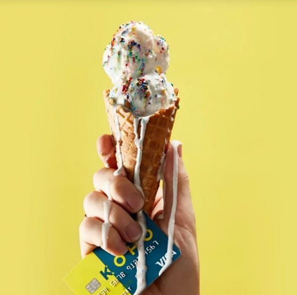
This summer, the brand’s ads are as a bright as a mid-August Ontario summer day. An image of a melting ice-cream, dotted with rainbow-coloured sprinkles, in a waffle cone being held up in a hand that’s also grasping a Koho-branded credit card is clearly meant to be lapped up by millennials and Gen Zers.
In fact, the ad appears next to the bonkers Refinery29 Money Diary, which was anonymously written by a 24-year-old TTC fare-evading PR consultant in Toronto, that got widely hate-read (even by Brad Ross, the ex-TTC comms person) and thus presumably widely seen last week. Buying ad space on the trendy site, which opened a Canadian outpost last fall, was a savvy move that has probably already paid off via increased brand awareness.

The ice-cream post only has 38 likes since being posted last month on Koho’s Instagram page. And while other recent Insta posts, like the above post featuring Gen Z Yellow and an arm holding a coffee mug through a hole in the wall, are visually on point they’ve racked up a fairly meagre number of likes and even fewer comments.
Fintech and online-only bank brands tend to look so similar these days that Up Cannabis even created a parody brand to promote its products. So it’s a bit of a shame that after opting for a look that helped them stand out from the crowd Koho’s current visuals are hard to differentiate from its rivals.
Like a high schooler Koho still seems to still be figuring out its look, but here at Stim we’d say standing out is better than blending in.
Credits
Advertiser: Koho
Related Articles
-
 St. John’s Board of Trade makes greeting cards for delayed packages
 -
 RenoAssistance has fun with the horrors of finding a contractor
 -
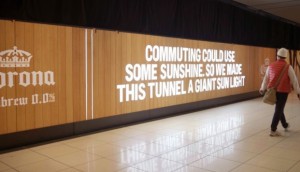 Corona sees a light inside the tunnel after Daylight Savings
 -
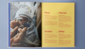 Prema-Quebec makes a book that’s the same weight as a premature baby
 -
 The FIFA World Cup Trophy tour touches down in Toronto
Random Cool»

This year’s selection of under-the-radar ideas includes better for the planet deodorant and a way to level up your bread making.
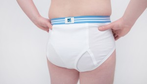
Rethink created a pair of briefs for Prostate Cancer Foundation BC that let men get tested without baring it all.

A replica of the titular TV vessel is offering overnight visits to non-crew members for the first time in 22 years of service.
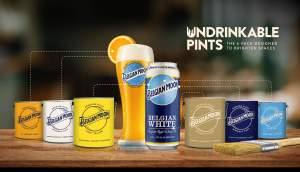
The beer brand has released paint colours to encourage employees to reclaim their own spaces after years of working from home.

Rethink created an animatronic hen to build hype for Nuggs, a McCain-backed vegan nugget brand.

Leave a Reply