Radiating logo
Sonos accidentally creates a brilliant rebrand.
![]()
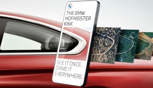
Sonos recently engaged Bruce Mau Design to help lead a rebrand for the audio manufacturer. While it features new, vibrantly coloured ads (you can see some of the posters and subway ads from New York below), what has been getting the most attention is the company’s new logo. If you haven’t done so yet, scroll up and down on this page a bit. Go ahead, I’ll wait.
Notice anything? The lines radiating from the name were originally meant to create a feeling of amplification and radiation for a company best known for its wireless speakers and cloud music apps. But it creates an optical illusion when you scroll, making the lines vibrate and creating a moving, sound wave-like pattern. The design firm has said the illusion is a “happy accident” that they noticed during development and have worked to make the effect more prominent and incorporate the theme into more of the campaign. Wouldn’t it be nice if we could all just accidentally create the perfect solution to all our business problems?


Credits:
Brand: Sonos
Agency: Bruce Mau Design
Creative Director: Laura Stein


Random Cool»

This year’s selection of under-the-radar ideas includes better for the planet deodorant and a way to level up your bread making.
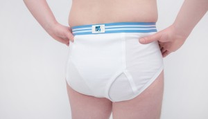
Rethink created a pair of briefs for Prostate Cancer Foundation BC that let men get tested without baring it all.

A replica of the titular TV vessel is offering overnight visits to non-crew members for the first time in 22 years of service.
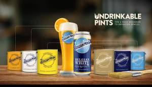
The beer brand has released paint colours to encourage employees to reclaim their own spaces after years of working from home.

Rethink created an animatronic hen to build hype for Nuggs, a McCain-backed vegan nugget brand.

Leave a Reply