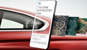
McMinimal
We sincerely hope the clock isn't ticking on this design trend.
Okay, so this Stim editor has made no secret of her love for minimalism. Can’t help it. It’s just so. Damn. Good.
The amazing thing about minimalism in design is that one might think all minimalist design is the same, but Leo Burnett and Thjnk are the latest creative shops to prove that with minimalism, the possibilities are still maximal.
In order to promote McDonald’s Germany’s new 24-hour offering, the agencies created segments of clocks, colouring different lines to subtly convey iconic menu items from the Golden Arches.
A few different shades of brown, combined with a little imagination, turn into a Filet O’Fish so easily. Two peach-coloured lines with a white middle and a tiny yellow dot? Hey, we all know a McMuffin when we see it, right? And what else could two all-brown dashes, special beige, green, yellow on a sesame-seed bun be?
Try and guess which menu item is depicted in each image.


Credits
Client: McDonald’s Germany
Agency: Leo Burnett, Germany; Thjnk, Germany
Chief creative officer, Leo Burnett: Andreas Pauli
Chief creative officer, Thjnk: Armin Jochum
Executive creative director: Jörg Hoffmann
Creative director: Florian Fehre
Lead creative: Gustavo Nardini
Art directors/Illustrators: Gustavo Nardini, Marco Sodano
Account: Netti Weber


Random Cool»

This year’s selection of under-the-radar ideas includes better for the planet deodorant and a way to level up your bread making.
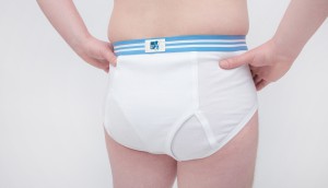
Rethink created a pair of briefs for Prostate Cancer Foundation BC that let men get tested without baring it all.

A replica of the titular TV vessel is offering overnight visits to non-crew members for the first time in 22 years of service.

The beer brand has released paint colours to encourage employees to reclaim their own spaces after years of working from home.

Rethink created an animatronic hen to build hype for Nuggs, a McCain-backed vegan nugget brand.

Leave a Reply